Kinly
Kinly is an inclusive financial technology company that proudly serves the unique needs of Black America and its allies.
Industry: Fintech startup (sold to Greenwood)
Responsibility: Branding, UX, UI, and research
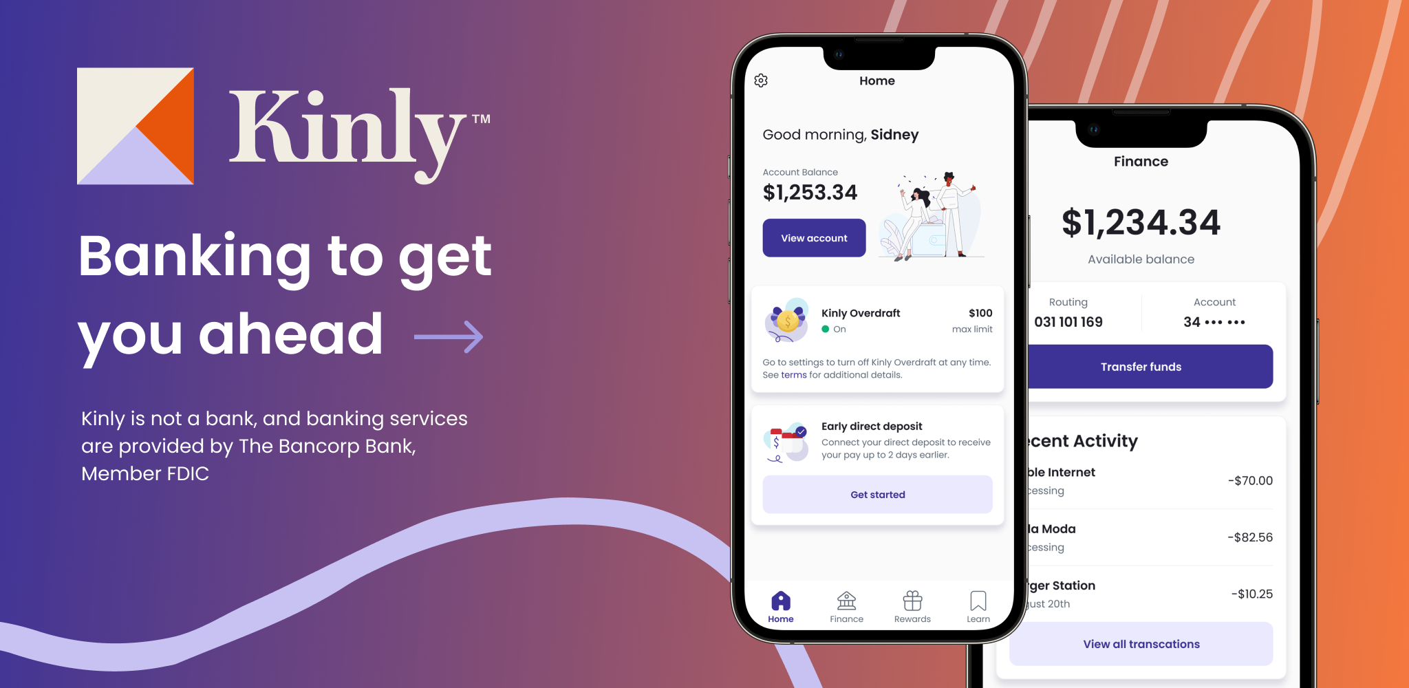
Kinly has gone through quite an evolution in its branding and UX. Growing pains of startup life, but I take it all in stride. The first few iterations were my responsibility as a design team of one (just lonely me). The above branding was created by a design team of two.


the process
Before I get to the point of any of the polished screenshots above, there are always white boarding sessions to map out the user flow. I starting with the happy path and iterate based on feedback from product managers, developers, and user testing data. Once that path is defined, I focus on one section at the time in order to further refine and poke holes in the path until it’s ready to wireframe. I seek feedback until it’s ready for high-fidelity mocks.
the happy path

User flow: Happy path
user flow: create account flow version 2
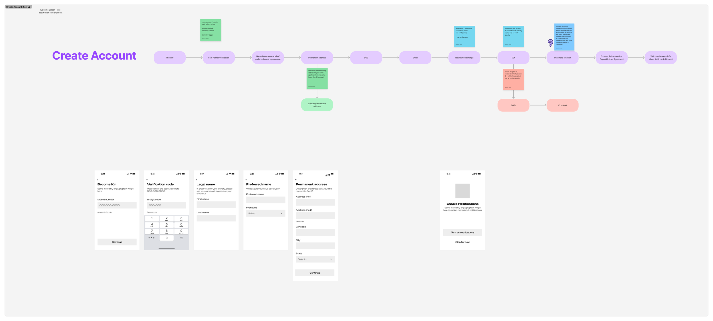
Here, I started laying out some wireframes while I awaited feedback on the user flow. In a startup environment, I always try to keep moving things forward since the timelines are compressed and the teams very lean.
user flow: create account flow version 3
User flow with divergent paths, wireframe, and high-fidelity mocks (with the latest branding).


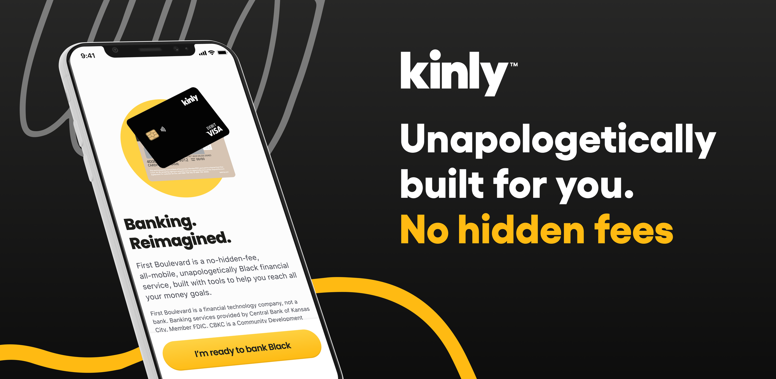
To see more about the latest version of the branding, click here.
This branding was developed by a design team of five - two product designers (one of whom was me), two graphic designers, and a brand strategist. It’s still a work-in-progress.